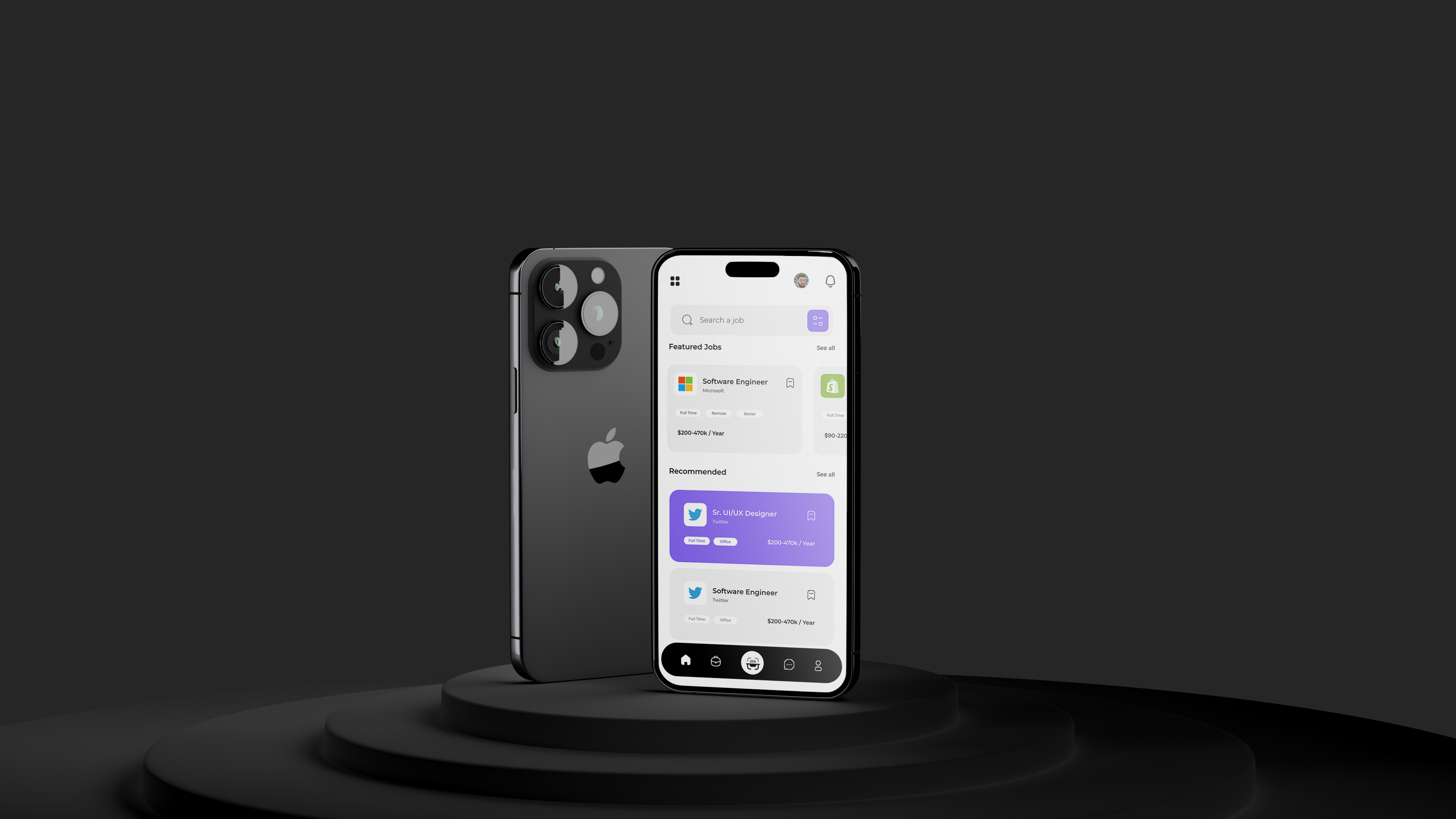
Online business
and employment-focused social media
Presenting all of these features in the most understandable and comfortable way to users was a lot of work. Using the right components wouldn’t be enough. components also need components and HUDs just to get the users to understand the purpose of a particular component, how it works and it’s use case. Animations, interactions, colors and illustrations were also presented in these manner including colors which meant everything had to work together as one.

Using the right components wouldn’t be enough components also needed components and HUDs just to get the users to understand the purpose of a particular component, how it works and it’s use case. Animations, interactions, colors and illustrations were also presented in these manner including colors which meant everything had to work together as one.
We had to build certain design systems that consisted of certain micro/ major design aesthetics that affects colors, sizes, fonts, spacing and conditional visibility rules given to every component. This helps us and developers as well understand how, why and when certain font end adjustments would be applied in order to maintain a fully editable library of visual flow and aesthetics in the app.
Wireframes had to be created for user flow journey optimization, each user flow was named and also displayed certain components and elements that linked to other user flows/ experiences depending on the purpose and action/ condition created by the purpose and the action and also components/ widgets presented in every user flow allowing the user experience to feel more meaningful and on the long run well understood.
Have it in mind that this is just a concept and a side project every project measure taken and documented on this project would be replicated for real-life projects that come our way
WORK WITH US